Si, nosotros también usamos cookies. Esas cosas con nombre de "galletita" que ayudan a que tu navegación sea más personalizada. Cierra este mensaje y nos darás tu permiso para seguir utilizándolas. Y seguirás disfrutando de diarioDESIGN como siempre.

Feliz viaje por nuestra web Cerrar
Gemma Figueras
13 septiembre 2013

The affable office: we take a look at Desigual’s new corporate headquarters.
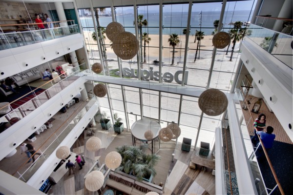
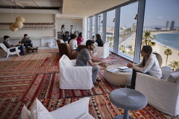
More than 24,000 square metres, six floors, capacity to accommodate up to 1,500 people with the Mediterranean Sea for a backdrop: this is Desigual’s new corporate headquarters in Barcelona. In a structure designed by Ricardo Bofill adjacent to the W Hotel (or Vela as its known), this new building, with interior design by Turull-Sorensen architects, brings a dynamic and creative energy to this rapidly emerging leisure zone in Barcelona.

Read more about Desigual en diarioDESIGN.
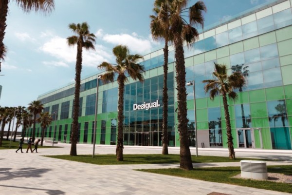
The new Desigual corporate headquarters has been designed as a framework within which to contemplate, feel and experience the environment that surrounds it: a wonderful view of the beach on one side, and the Barcelona city port on the other. Through its glass skin, employees and visitors can follow the pulse of city life with the sea as a backdrop.

Regarding the interior design all elements have been chosen to generate positive vibes. The employees themselves have been involved in making decisions about the layout and organization of this new interior space. A group of 81 ‘change ambassadors’ analyzed and decided the use of the spaces, work processes, services and even the manner in which it would be shared.

The interior layout has sought to promote teamwork from a multidisciplinary perspective (employees are organized according to challenges rather than functions) creating connections between different people from different areas in both a formal and informal sense. To do this, the space itself generates the opportunities for creative connections in the day-to-day encounters and meetings.

Every corner of the building breathes the Desigual corporate spirit. The architectural firm that designed the project Turull-Sorensen, has also been responsible for the concepts behind their stores for some years now.

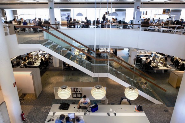
The generous entrance hall, dubbed «Life is cool«, is a central atrium that affords the chance to soak in the Desigual atmosphere. Several reception counters, a café and multiple sofas are located under a sky of wicker lamp shades, conceived as a meeting between employees and visitors in a space that allows workers use their computer, hold both formal or less formal meetings or just relax with a coffee.
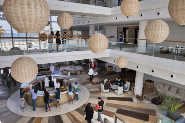
Painted or natural wood textures, wicker and bamboo are dominant features of the décor and furniture. As well as the fabrics, such as canvas covering the central canteen space, evoking the desert haimas used by nomads as well as functioning as an acoustic baffle. Eight types of wood paving are combined on the ground floor hall worked into a radial pattern. The carpeting applied in blocks over all the floor levels feature varying designs. The sound-absorbing material, reminiscent of scattered rugs is both practical and decorative.

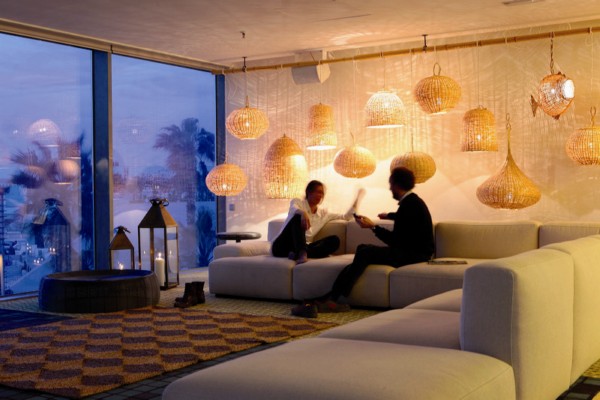
The selected design pieces are both eclectic and functional, much of the furniture such as the copper tables, the benches and the rush chairs were sourced in the street markets from Marrakech. Others, such as the circular wicker lamps of the lobby are made by a craftsman from Osona while the hydraulic tiles at the entrance to the stairs, are also made in Catalonia. The whole ensemble recreates a very visual and graphic atmosphere especially within the canteen show-cooking zone which takes the company’s first logo as their inspiration, based on its two popular robots.
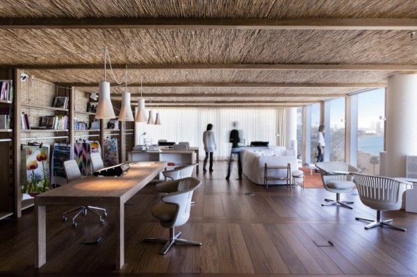
Here there are no fixed work spaces. Every employee, from the departments of design, production, marketing, human resources, retail, sourcing and the manufacturing workshop lives in a ‘neighbourhood’ located within open plan areas without cellular offices or dividing partitions. All the spaces belong essentially to everyone. There are personal lockers, but the tables, office equipment and monitors are commonly used and shared. At the end of every day, everything is collected in accordance with their policy of «clean tables.»

An integrated communications system including chat, laptops supported telephone and video calls with free wifi from anywhere in the building makes this possible without having to be plugged into a network cable. For those times when greater concentration is required, or working with other partners on a common project, or for an informal meeting or to make a presentation with a projector there are multiple spaces specifically designed and intended for those uses (rooms, think tanks, touch downs, dream rooms…).
This friendly and intelligent building has also been careful with its environmental foot print: to reduce energy consumption the air conditioning systems run parallel to the facade, allowing greater aesthetic and functional integration. To reduce the need for air conditioning the windows are double glazed and have solar protection with integrated shutters that deflect the light. The lighting is centralized and zoned, and includes an automatic shutoff system, LEDs and / or high efficiency fluorescent lights, occupancy sensors and timed switches.

The bathrooms have dual flush cisterns, dry urinals and motion sensor taps. The sink water is recycled via a filter pump that leads back to the cisterns throughout the building and also waters the plants on the roof. And to encourage sustainable transport, 65% of employees go to work by either public transport, walking or on a bicycle (with parking provided). There is a bulletin board for anyone travelling by vehicle offering carsharing options. A way of working quite unlike other office environments.

Photos: Rafael Vargas. Image courtesy of Desigual.

Desigual headquarters
Passeig Mare Nostrum, 15
08039 Barcelona

Artículos relacionados

Schmidt presenta algunas de las claves para desconectar en casa del teletrabajo

Grand Comfort o cómo la primera colección de muebles diseñados por Le Corbusier se convirtió en un clásico

Masquespacio diseña el nuevo espacio Lynk&Co Club Madrid

sant-climent-aluminio-diariodesign-portada

Una vivienda en Sant Climent de Sescebes que reformula el paisaje arquitectónico local