Frankfurt Station, a new stop in Barcelona for a journey through space and time.
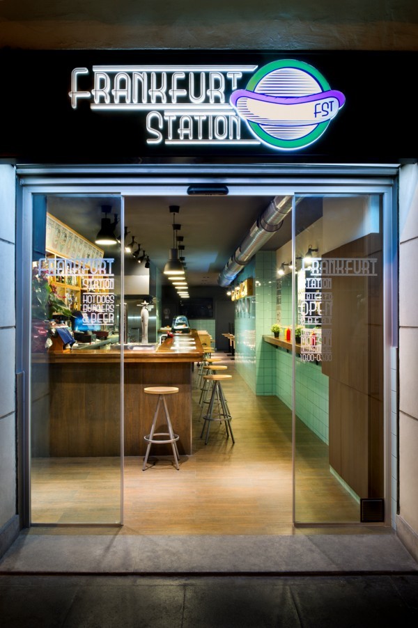
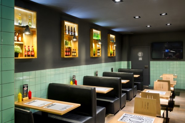 Frankfurt Station is a both a dual concept eatery and a clever play on words. German sausage and urb / Eating and travelling. A new restaurant in Barcelona where space-time and low-cost design come together within the same project. A fast food restaurant inspired by a train journey that stops at a vintage café within a public transport station.
The artifice behind this idea was conceived by interior design studio Egue y Seta in collaboration with Denys & von Arend, the internationally renowned studio whose trademark is the framing of dialogue between public and private spaces as well as different typologies, as is the case here between dining and transport.
Frankfurt Station offers a culinary journey through time and geography: eating the celebrated German sausages while travelling back to the 1950s, but in an innovative way. Its design, just like the concept itself is also twofold, alternating on a formal and aesthetic level between light and shadow, between brightness and opacity, between colour and monochrome, image and text.
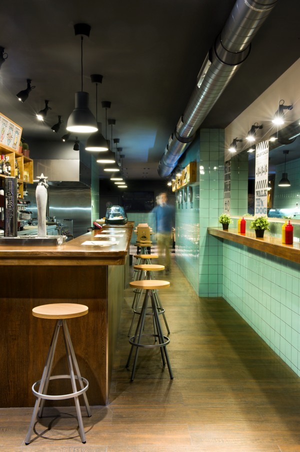
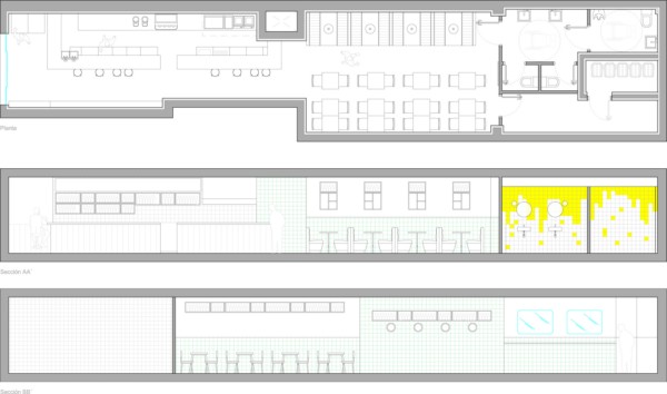
The type of food and the layout of the restaurant, an elongated space measuring 96 square metres, provided them with the idea of turning this restaurant into a platform and a wagon. The traveller/diner arrives at the ticket office/bar where they can consult the notice board/menus and choose a ticket/dish.
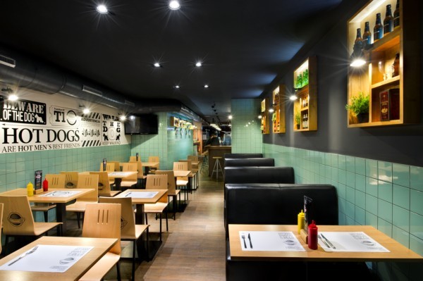
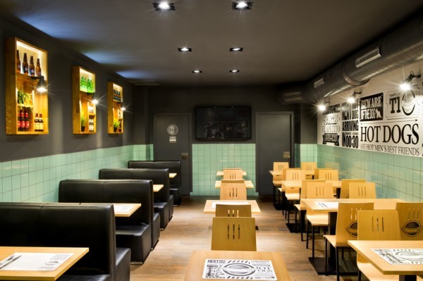
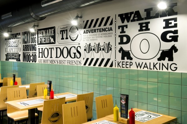
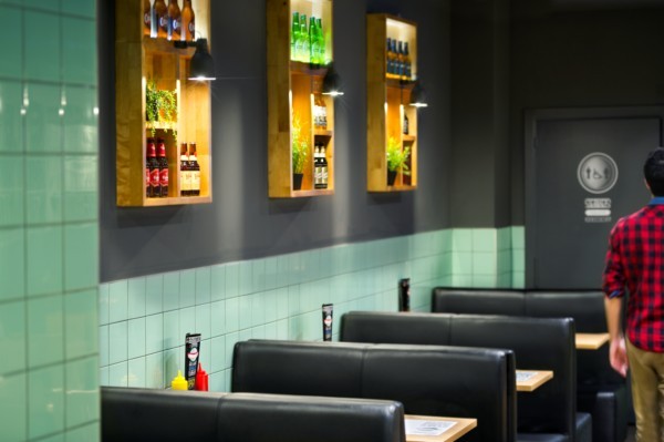
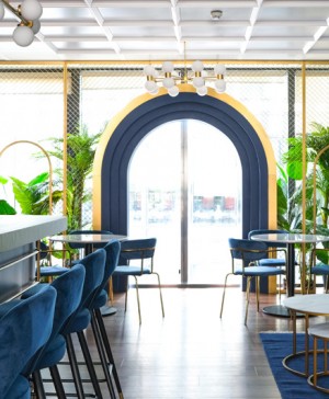
From there they can board the train/dining room, where the layout of the tables is inspired by a typical train wagon, double seats on either side and a row of individual seats down the centre.
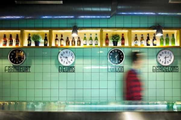
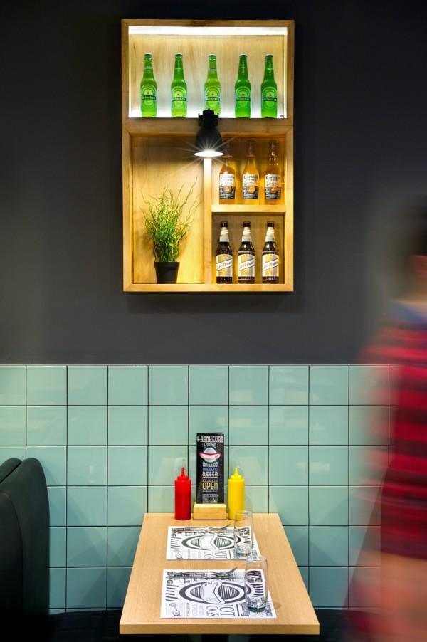
And then of course the windows formed by back-lit timber shelves in which, instead of landscapes, travellers can enjoy the view of beers sourced from different parts of the world.
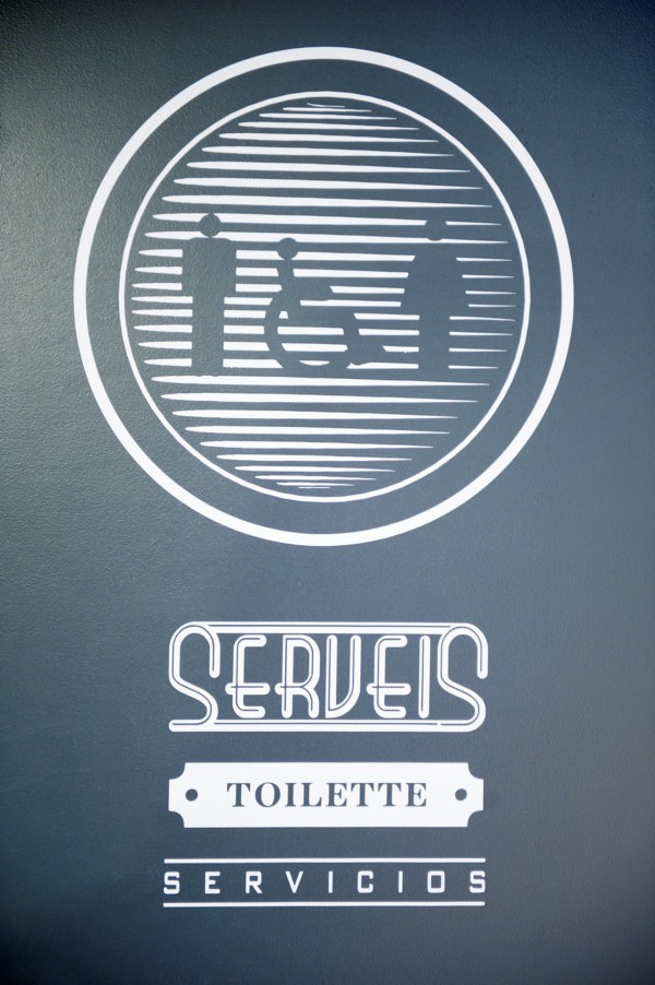
And since the place is also supposed to be a train station, there are plenty of other details such as wall clocks, the signage and normal illustrations found within a train station: schedules, advertising and in this case also the menus. But treated in such as way as to “create a more harmonious graphic environment”, according to its authors.
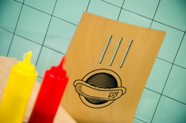
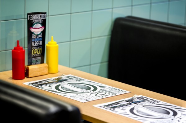 The time travel aspect meanwhile allows diners to visit a roadside cafe of the 50s evoked by the ceramic wall tiles and metal surfaces. The combination of wooden floors and tiling stands out against a dark grey background used for the ceilings and walls.
The typical timber cladding of this public space typology was also resuscitated. When considering public facilities of this nature such as a train station, the same design philosophy applies, the requirement for highly resistant finishes, low cost materials and easy maintenance. But at the same time providing warmth which is often missing in these types of spaces.
For the tiles, for instance, a retro tone of vintage green was used combined with an anthracite colour for the grouting and, «providing a more decorative, distinctive and singular quality.»
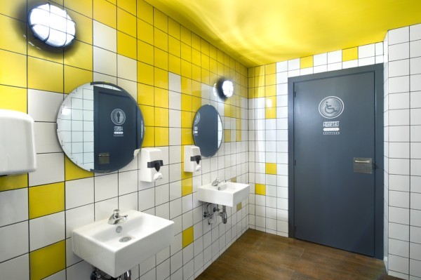
For the bathrooms unconventional colours and more unusual patterns were used making for a more vibrant approach.
Photograph: Víctor Hugo
Denys & von Arend Rambla Catalunya, 43, 4º 1ª 08007 Barcelona Tel: 934 879 850 barcelona@denysvonarend.com
Egue y Seta C/ Joaquín costa 24, locales – 4º 1ª a 08001 Barcelona C/ Pez, 27. Oficina 316 , 28004 MadridC/ Valera Silvari 12. 2º. 15001. A Coruña info@egueyseta.com

