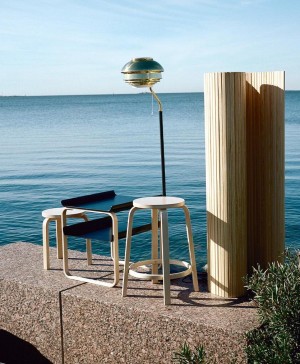
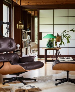
Vitra dazzles yet again with its latest products in the Furniture Fair in Milan 2011.
 It is difficult to find anything wrong with any of the latest products by the emblematic Vitra presented this spring at I Saloni. Although we are already used to it but knowing their catalogue and track record, it is safe to consider this iconic Swiss brand as the top in contemporary design furniture.
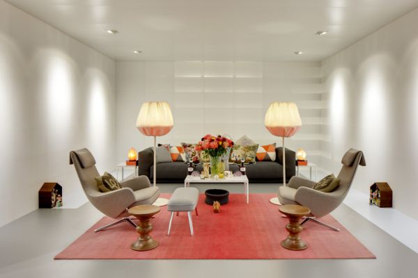
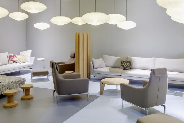
 At the last Milan Fair, their stand was one of the most visited. The space literally became small and it was chock-a-block. Several domestic sets introduced the eager visitors to the “Vitra home”, a concept reminiscent of their show-room VitraHaus, built by Herzog & de Meuron in the shape of various stacked homes. But there was also a complement to this domestic vision: we could see exterior elements, for the first time an outdoor chair, and also pieces for the “Vitra office”, the other strength of their brand.
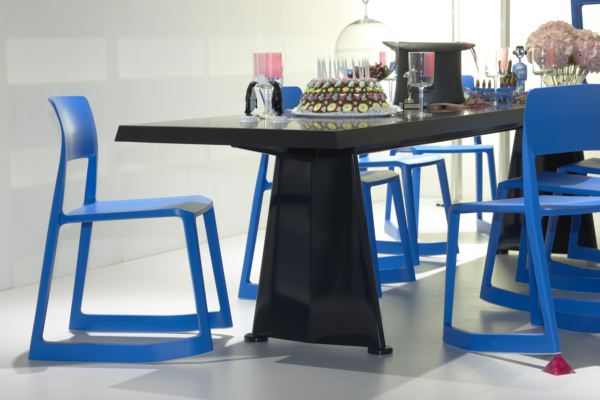
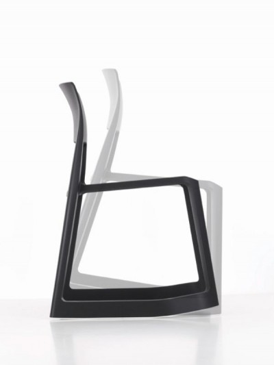
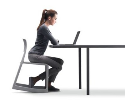
No doubt the star of the Vitra 2011 catalogue has been the Tip Ton chair, a plastic chair that is cheap, ergonomic and comes in colourful tones that have gained many fans. Designed by Edward Barber & Jay Osgerby, Tip Ton defines a new type of seat: it is a chair that leans forward. Its name refers to this feature of dual position, balancing.
 Its great innovation lies in the inclination of 9° generated by the shape of the skates of the chair, which favour a new posture when standing up, until now only available on mechanical office chairs. The pelvis and the spine are straightened, and it promotes blood circulation. The chair is made entirely in plastic from a single mould so it’s virtually indestructible and completely recyclable. It has been designed for a variety of settings: schools, libraries, cafeterias, offices, and why not, homes. Tip Ton is stackable.
This is the first project between Vitra and Edward Barber & Jay Osgerby, architects of the London Royal College of Art. You can see the video about Tip Ton here.
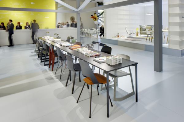
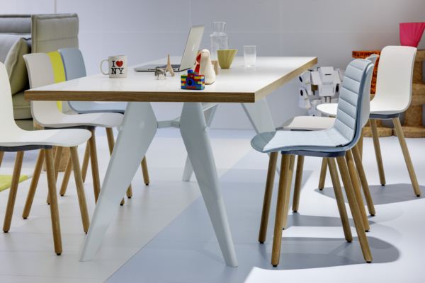
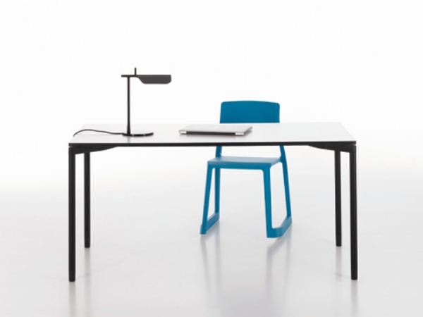 And it seems that the collaboration with Edward Barber & Jay Osgerby has been fruitful. Also by them is the Map Table, a programme of universal tables that can be used in a flexible way that optimises space. So much so that Vitra used it as a great central meeting table in the booth in Milan. The designers, with a great deal of experience in planning training and conference rooms, came to the conclusion that it was necessary to develop a new system of tables which was simple and flexible. Map Table is made of sturdy boards coated with melamine in rectangular, square, trapezoidal or round shapes allowing a large number of configurations. The legs are tubular steel and allow different positions to mount the tables: lined up in the front, one next to another, stacked or connected together. In short, the ideal table for the office or the “home office”.
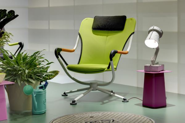
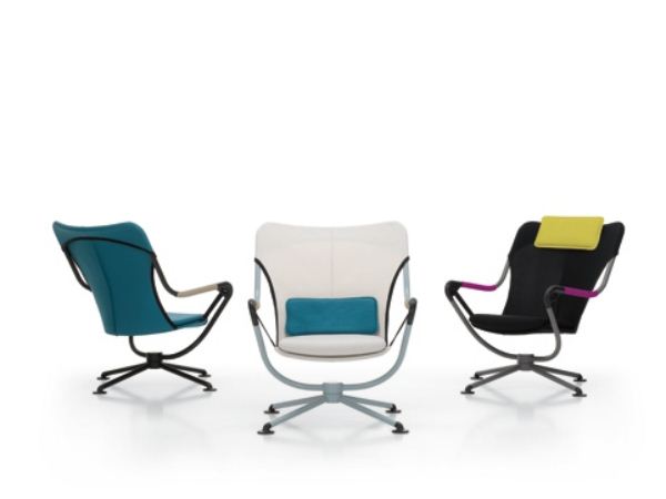 Another of the most attractive products has been the outdoor armchair Waver, designed by Konstantin Grcic. Also the first project of the German designer with the Swiss company, and certainly aesthetically very different from the many other projects that Grcic has presented for other brands. On this occasion, the German has let his hair loose and left behind his “engineering” side. Waver is a surf-inspired armchair, made with materials used for outdoor sports such as windsurf or paragliding. The structure: light; the performance: maximum. And the armchair is certainly comfortable: the user floats over a cloth seat attached to the tubular steel frame by means of two straps. The fabrics have been chosen in an energetic range of fluoride colours of sporty character. No doubt, the very best of the fair, that’s why we include it in one of our top 5 products.
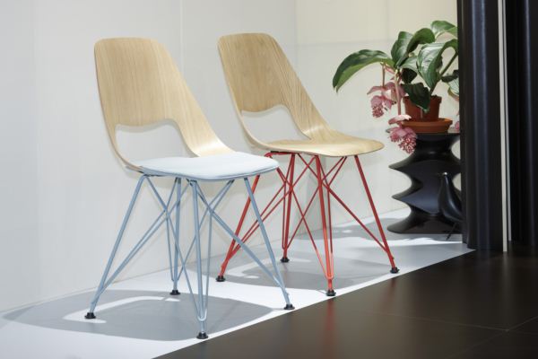
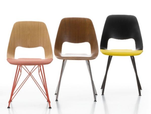
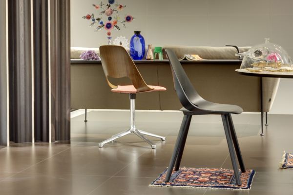 Another of our Top 5 was the Jill chair by the Argentine Alfredo Häberli, also a first collaboration between the designer and the brand, inspired by the technique of moulding plywood. In the 1940s, Charles Eames succeeded for the first time in moulding plywood in a three-dimensional way, making possible the manufacturing of organically-shaped seats. But he did not achieve the creation of a one piece frame. But finally, through a patented process, the wood veneers of the Jill chair curve until they come together aligned on the surface of the seat. Two infinite lines, one internal and another external, cross and frame the surface, generating a sculptural form that follows the shape of the body, embracing it with surprising comfort derived from its remarkable flexibility. The basis of Jill, made of tubular steel, cable, aluminium and wood, also make reference to historical models. Its colour is strong and expressive, in line with the optional upholstery available in fabric.
According to Alfredo Häberli: “Jill’s inspiration comes from the Leg Splint, designed by Charles and Ray Eames in the 1970s for the US Navy. The fascination generated by the three-dimensionality of the upper part and the tension of the holes, gives the board a great sculptural value that goes beyond its functionality. Plywood Elephant has a similar fascination due to its plasticity and the milling of its face. The cantilever projection surface of the Jill seat, similar to a trampoline, raises the question of whether perhaps it is a frame with a seating surface or a seating surface framed by a ribbon for the back. The different bases and their materials make the frame explicitly stand out, while its styling makes a visual reference to the flexibility and elasticity of the seat’s frame. You can see the video of the Jill chair here.
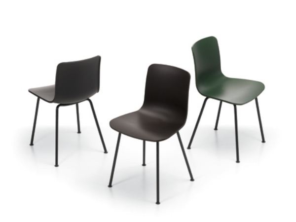
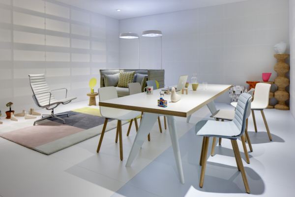 In this luxurious catalogue, you cannot miss the “super normal” designer, as Jasper Morrison calls himself. His philosophy is that of an “ordinary guy” who designs just “normal things” and has collaborated for many years with Vitra. His programme of Hal chairs can satisfy the most diverse needs: his wide range of bases, colours and fabrics are combined with a frame which is flexible and comfortable and made of synthetic material.
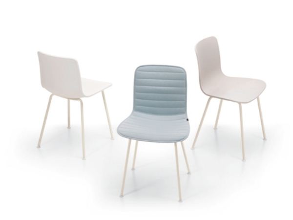 The frame can be combined with different bases: tubular steel makes it stackable, wooden legs that give the chair a homey feel, another with free oscillation, with and without armrests, and two barstool type variants in different heights. Hal is thus a universal chair that looks good both in private homes and restaurants, shops, offices, surgeries and studios. Also, with a powder coated base it can be used outdoors. Hal meets all health and safety regulations, it is strong, easy to clean and once it has reached the end of its life cycle can often be recycled (depending on the material). Who could ask for anything more?
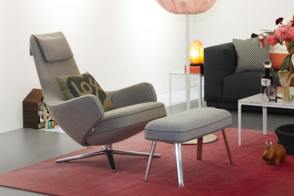
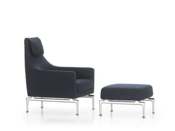
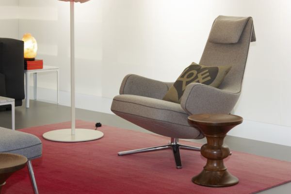 We can’t finish the review without mentioning a classic Vitra designer: Antonio Citterio, who has designed for the brand for over 25 years. He presented the Grand Repos armchair and the Fauteuil Suita. Grand Repos is a swivel armchair for the home inspired by office chairs. With generously sized padding and welcoming armrests, its back and seat can be moved independently and be set at different angles. A hidden mechanism adjusts automatically to the user’s weight, guaranteeing high comfort and optimal back support. The armchair can be locked in any position. It is available in different types of leather and fabric, with decorative stitching that give it a distinctively modern and almost handmade touch. The base offers a polished version or powder coated in colour.
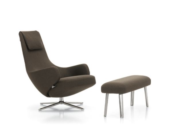 The Grand Repos comes with Panchina, a small padded bench, which can also be used as a simple informal seat in any room or waiting area.
More about Vitra in diarioDESIGN
Photographs courtesy of Vitra. Images of the Stand/Booth by Eduardo Perez.


