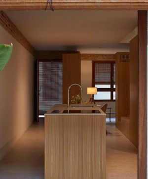
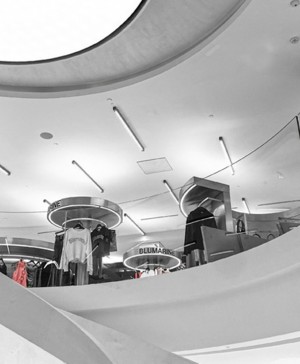
Torres Baldasano redesign a traditional house with a superb merging of a home and a family business.
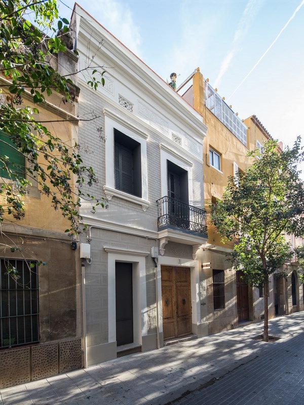
Some buildings have more lives than a cat. This one located in the exclusive neighborhood of Sarriá (Barcelona) is a clear example. First it was a family residence. Later the ground floor was turned into a lighting factory and then a shop. Now there is another business on this floor and a house on the first level. The young studio Torres Baldasano has defined a project in which dividing lines are clear but integrated, preserving at the same time the traditional building style of the area.
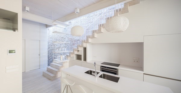
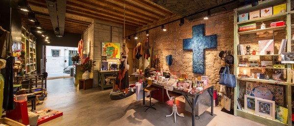
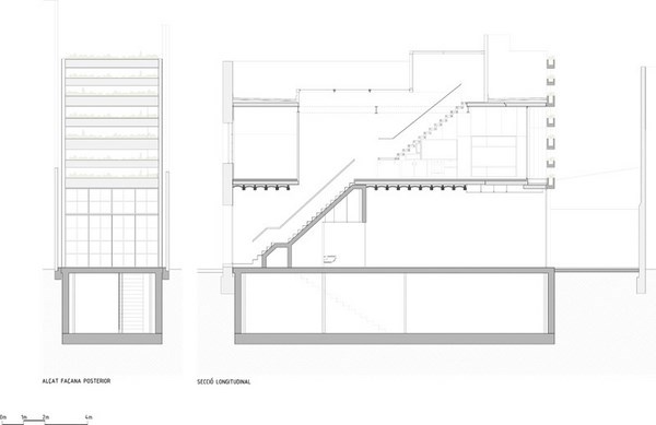
Commanded by Sara Baldasano in collaboration with Sandra Torres, founders of the studio, the assigment consisted on renovating the house including an extension to gain more useful area. In order to do so, the back of the building was broadened and endowed with an underground level, intended for the Passage shop premises.
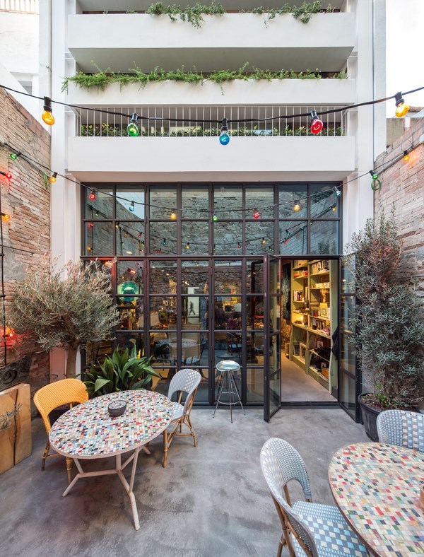
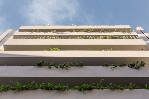
Integrating both spaces respecting the privacy of the house was the biggest challenge of this project. On the outside, Torres Baldasano opted to build a sort of vegetation lattice made of concrete on the back facade, serving as well as a screen that prevents from being able to see inside the house from the ground floor patio, which is part of the shop.
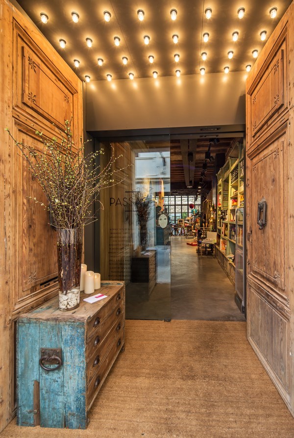
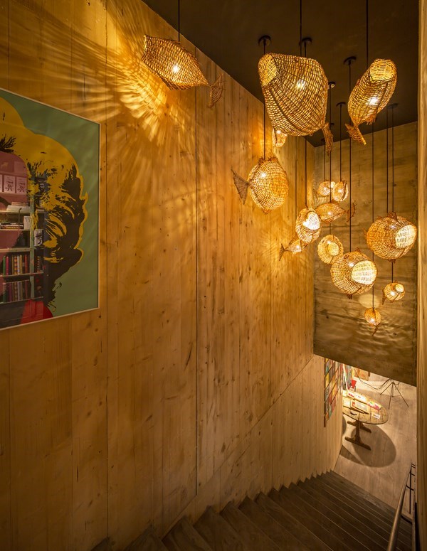
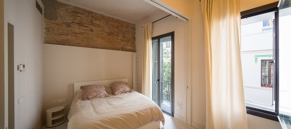
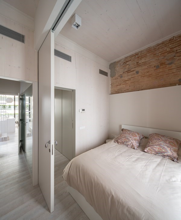
In general, the project seeks for recovering the original textures of the building. Stone and wood, therefore, are very present. Exposed brick and stone walls have been preserved, as well as the wooden beams on the ground floor’s ceilings. The other starring material is concrete. It has been used to build the back facade’s lattice and, specially, in the ground floor.
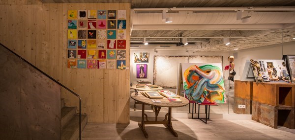
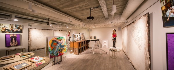
On the inside, the vertical panels of cross laminated timber in the shop allow to visually divide this space from the house. The environment also differs. Both spaces are open, but inside the shop a more eclectic style dominates while the house seeks for more clean, minimal lines.
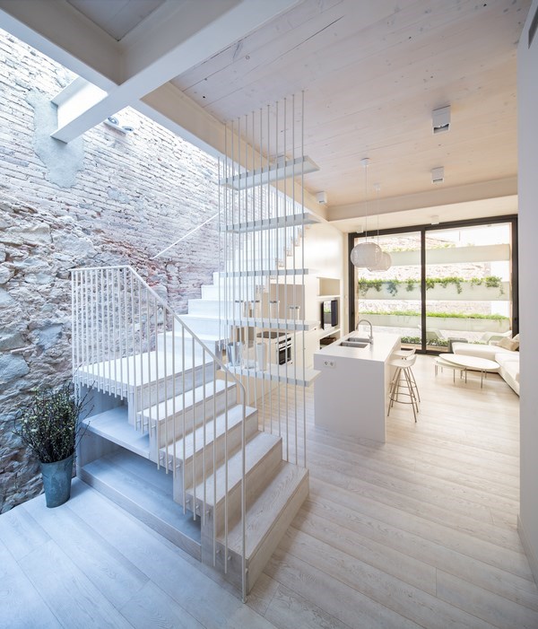
The staircase connecting the first floor with the deck is as well a starring feature, serving as a kitchen, storage and living zone at the same time.
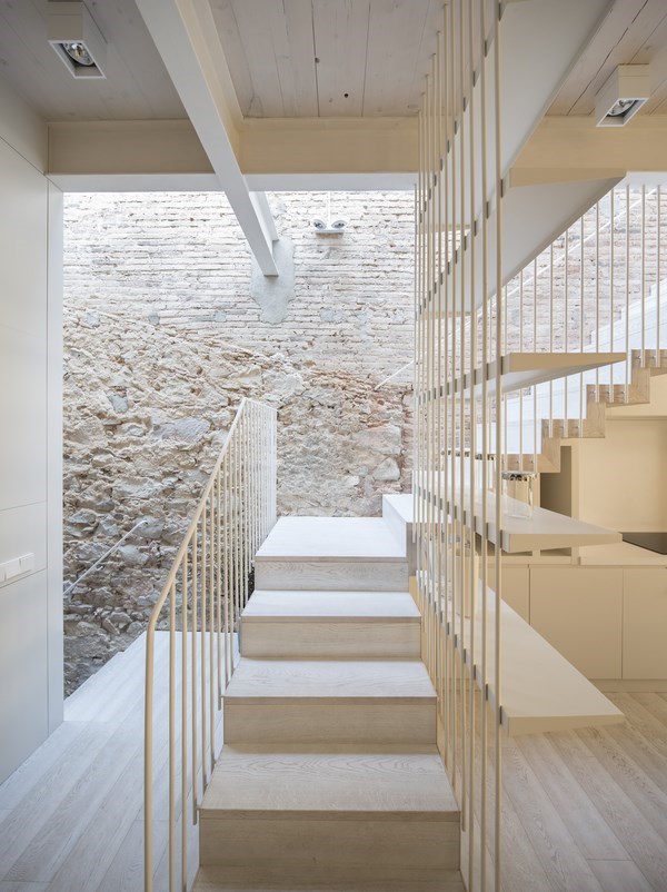
The aesthetics unification has been solved through the mix of the existing and new materials. In the house, wood has been combined with white walls, kitchen and living room furniture, and the staircase rail. «They harmonize with the original stone and brick walls of the building», says the studio.
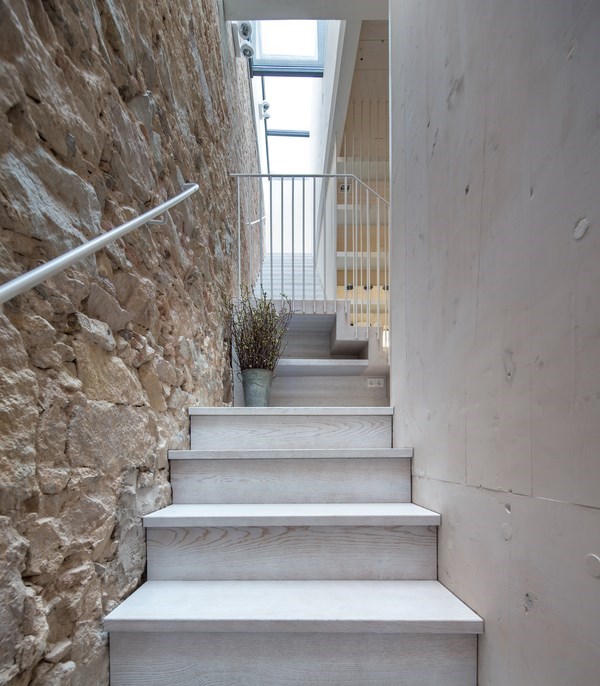
Another challenge of this project was to achieve the maximum light possible inside the house without compromising privacy. Therefore, in order to gain natural lighting they created a longitudinal opening in the roof that runs alongside the staircase. It begins on the lower part of the building, ending up on the top and turning into a terrace.
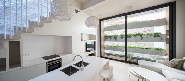
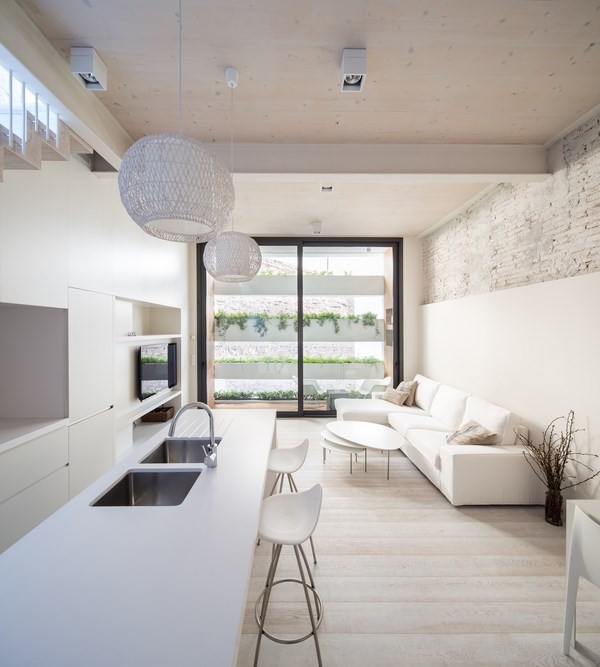
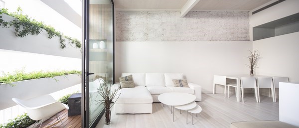
The house has an open layout. The only closed spaces are the bathrooms and one large room that can be turned into two small bedrooms through a sliding panel. Transit areas are also used as a dressing zone for the bedrooms.
