Taberna Wabi-Sabi by Sandra Tarruella: Spanish tapas tradition meets Japanese gastronomy
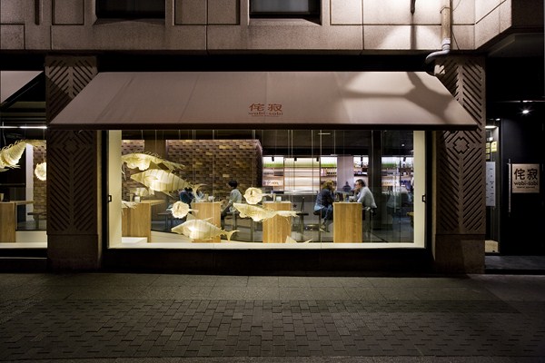
Some brave enough to do so are Javier and Antonio González García (of Los Zagales de la Abadía) and Mariola López. They have broken the mould with Taberna Wabi-Sabi, a Japanese tavern that fuses the traditional bars of Valladolid with Japanese gastronomy. The interior has been executed by Sandra Tarruella Interioristas, who have bestowed the space with a strong minimalist component and multiple cultural references.
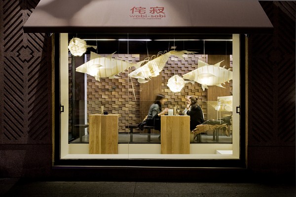
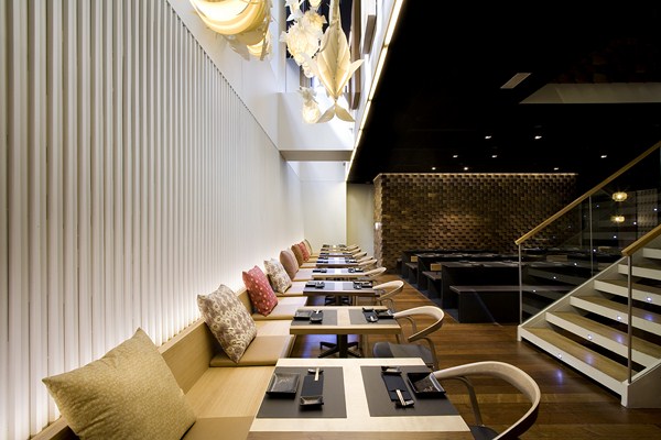
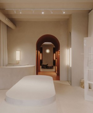
The locale, which is divided into two floors, visually communicates the ground and lower-ground floors via a large central staircase and atrium. The programme has been organised around this layout, creating a Japanese ‘tapas’ bar on the ground floor which is visible from street level, whilst a la carte is served on the lower-ground floor.
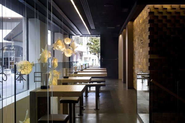
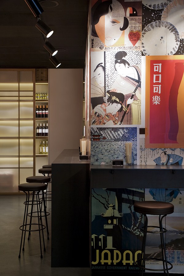
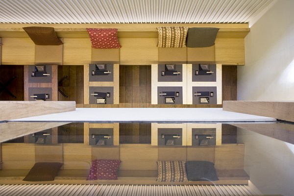
Natural oak has been used in abundance for the tapas area in the high tables and walls, which contrast with original and highly colourful Japanese posters of varying styles and epochs, as well as Japanese sliding parchment screens that partly close off the storage and display areas.
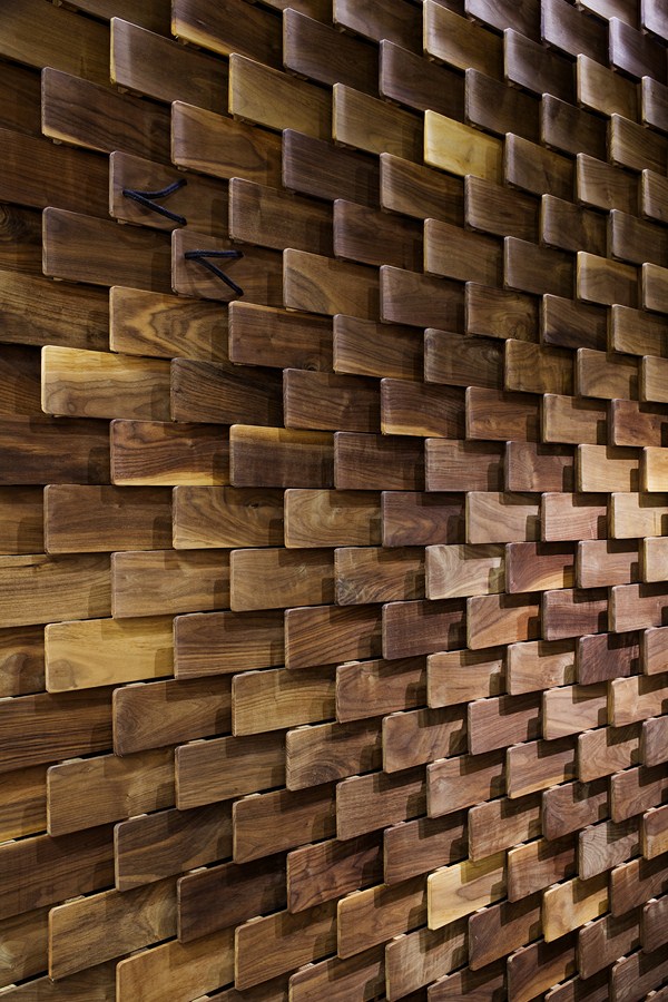
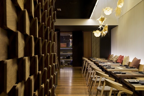
On the other hand, Walnut wood has been used for the tasting area and the rear wall features a spectacular mural made of the traditional footwear worn by geishas. This intervention brings warmth and texture to the space.
In Valladolid, it is customary to go bar hopping on foot and with groups of friends. The tasting area facilitates this strong tradition and the customers traffic, fitted out with high tables that run vertically over the two floors creating a floating sense. Fixed leather stools, high metal shelves and other seating can moved according to necessity.
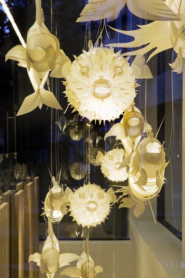
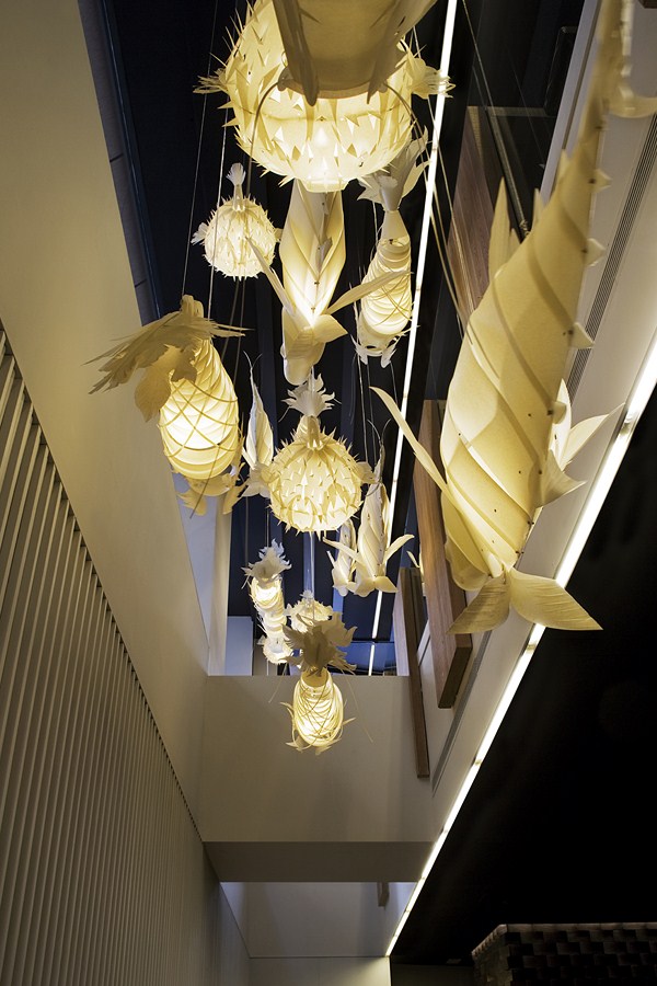
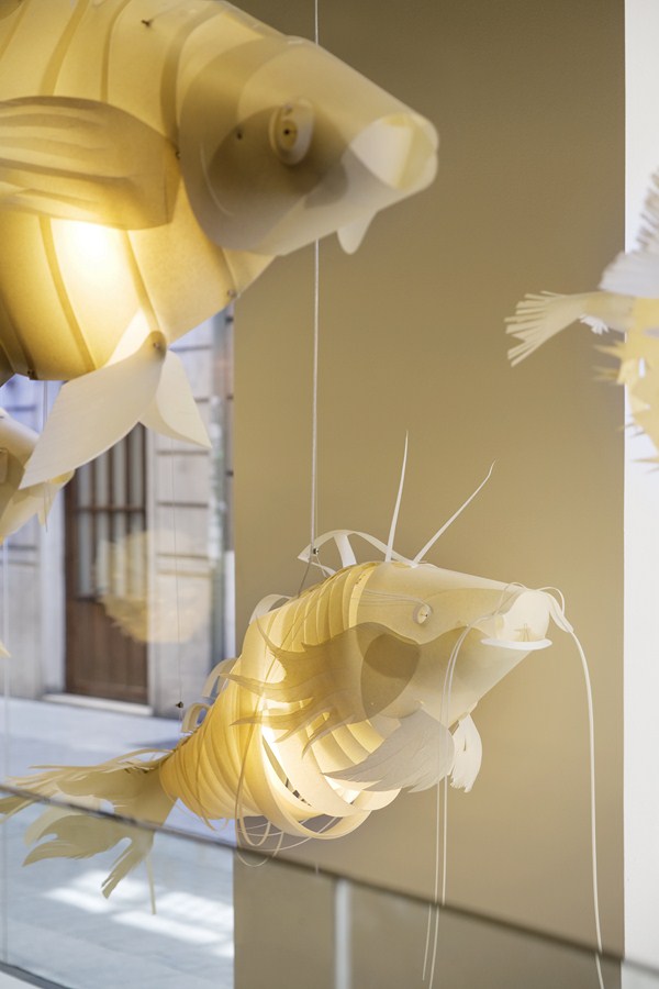
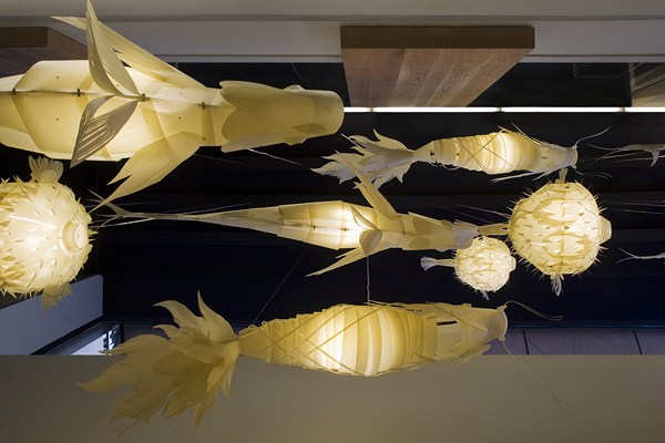
A curious feature made of parchment featuring blowfish, tuna and catfish -all widely used in Japanese cuisine- occupies the atrium that connects the two floors. it’s quite eye-catching and sheds a warm light over the two floors.
The lower floor has maintained a traditional restaurant character where various forms of seating and tables are offered around the staircase.
In front of the staircase there is a white wall with a running bench, made of noble wood, and square tables.
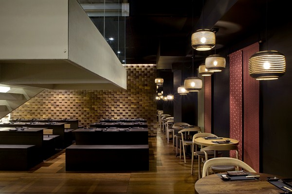
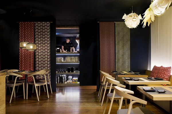
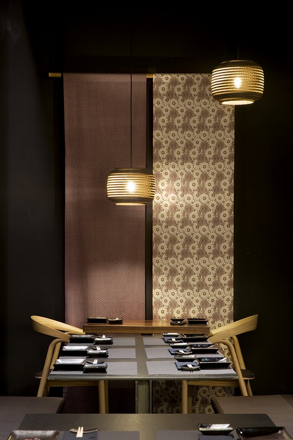
Behind the staircase, against a wall bathed in black, round tables have been placed and kimono fabrics are hung on the wall in a ‘tapestry’ fashion. This part of the restaurant is lit by cardboard lamps made by Graypants.
The central space has been organised with tables and metal benches that add a considered weight.
The main kitchen is also situated on the lower-ground floor. The entrance is framed by textiles which have been added to a dark yet warm space where wood and black artisan ceramic has been used, recreating the ambiance of a tavern.
Another mural made of wooden ‘geisha shoes’ delimits the module where the bathrooms have been placed, giving warmth and texture to this floor.
Overall, this project lives and breathes the philosophy that gave it its name – the beauty of ‘imperfection’, combined with a detailed attention to minimalism and the quality of objects made with natural materials.
Taberna Wabi-Sabi c/ Comedias, esquina Plaza Martí y Monsó 47001 Valladolid www.tabernawabisabi.com Tel: 983 35 32 33Sandra Tarruella Interioristas Responsable de Proyecto: Ricard Trenchs y Elsa Noms Colaboradores: Anna Torndelacreu, Paula Sebastián Fotos: Meritxell Arjalaguer

